Payment Process

Project 3: Payment process
Real life workshop and brainstorm
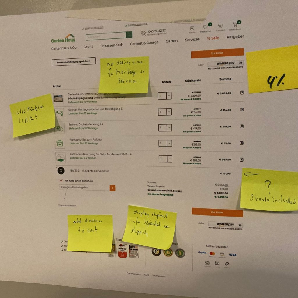
As a product team, we started out defining our webshops biggest weak-points. These were found in a study we did together in Berlin, looking through google analytics and cramming our work onto a blackboard. We went through many different excersizes, both in design thinking and product design methods. We were a very diverse team of 4 people, tasked with coming up with the best way to introduce our shop to the customers, and fix that singular painpoint. This lead os to 1 answer, we had a 40% falloff rate during the payment process.
Iteration 1 and user tests
The first question to answer was why, and to do this, I set up a prototype of the new steps we defined during the workshop. This prototype included 2 approaches: A 1-step checkout and an approach that looked like our own but with 1 extra step. We took this approach, and did user tests using rapidusertests. During these tests, we had them test the 2 new approaches, after trying out our current approach. We had 10 test subjects per session, without using many questions to understand the customer, and with looking at the recordings over and over again, these were the first iteration problems:
- The process of making an account was still very confusing.
- The original checkout was at this point as easy for the customer, so the work to implement it was not worth it
- The one page checkout did not work and many found it to seem like a scam.
Iteration 2 and user tests
During iteration 2 I tried to simplify the approach. This was done by getting rid of multiple buttons and readjusting the registration process. Compared to the first version, I removed a step by limiting the guest and registration login possibilities. During this, the mobile version was also getting tested more, as new tests showed that phone was very popular for browsing our site. We now started a mobile-first approach on all projects.
We went over the same process with rapidusertests, this time also asking some potential customers that were not in our target audience.
The final take-aways were as such:
- The users found this flow far easier, and the problems regarding registration were gone
- The buttons being removed from the top caused a lot of confusion for many customers, and as such they had trouble continuing.
- The 7pt grid made it feel much more organized for the customers
Final iteration and take-aways
The final iteration, and the one that will be implemented on the site, brought back the top button, and a help segment. We also brought back the 4th step from iteration one.
This version hit it off well with customers, and the outcome was far more of them actually finishing the flow.


